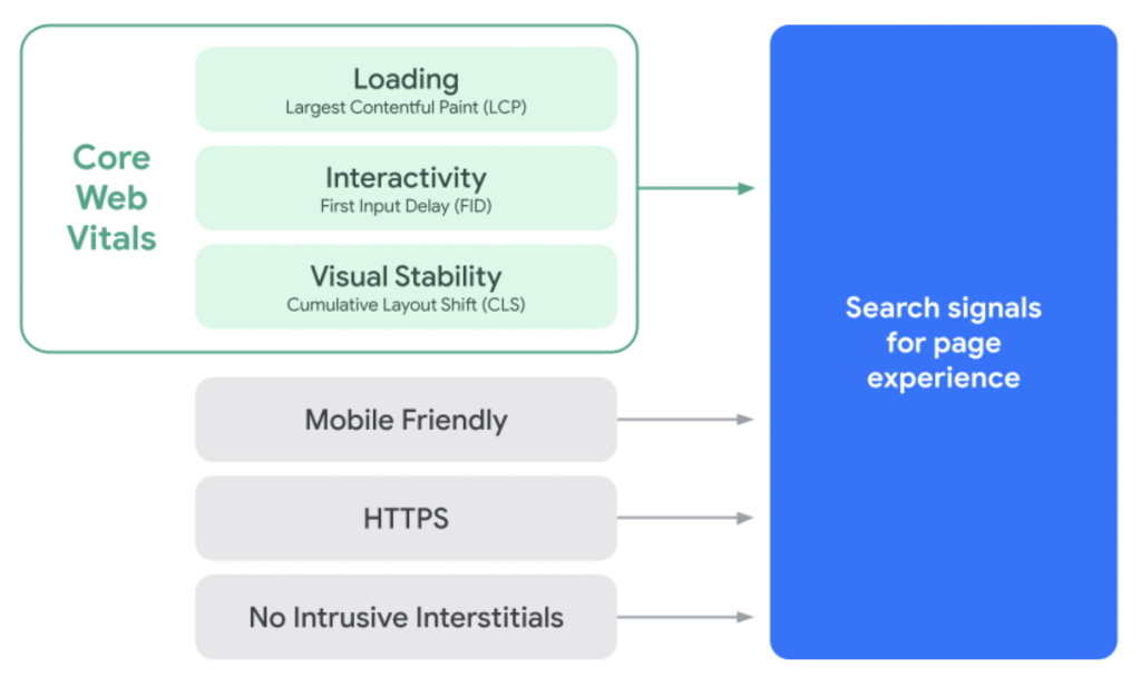
In May 2021, during their annual I/O developer festival, Google announced that Search signals for page experience would be changing by incorporating what is to be known as Core Web Vitals (CWV). These are a set of metrics related to loading speed, interactivity, and visual stability. Fundamentally, it is an attempt to give unified guidance when it comes to providing a holistic picture and measurement of the quality of a user’s experience on any given web page.
There are three main metrics within CWV: Largest Contentful Paint (LCP), First Input Delay (FID), and Cumulative Layout Shift (CLS).
Understanding why it matters
Simply because Search signals are changing, it does not mean one’s website will no longer appear in Google’s search results, as relevant content is prioritised over page experience. But understanding why the changes are being made could shed light upon what needs to be done from a business perspective.
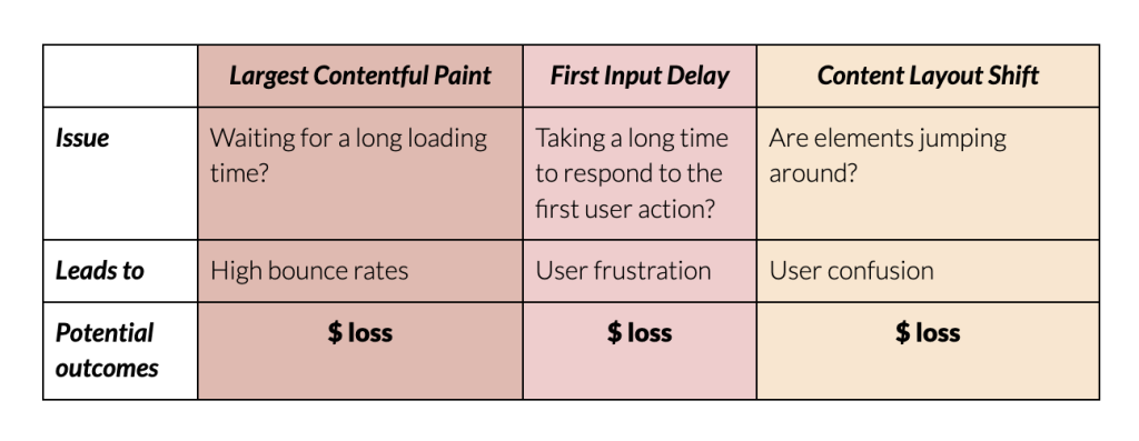
According to research at Google, when a webpage’s loading time increases to three seconds, users are over 30% more likely to bounce. In other words, they will not visit any other webpage on your site. This may seem like a lot, but it pales in comparison to the 90% that will bounce if your webpage does not load in the first five seconds.
Evidently, page loading times highly affect user behaviour, which is a primary reason as to why LCP is of high importance. Studies have shown that users will visit 8.9 pages when the loading time is within two seconds, yet a mere 3.7 pages when the loading time is seven seconds. In other words, a less than two second difference in loading time may mean the user seeing five less web pages on your website.
When it comes to FID – are you familiar with rage clicking? This is when users repeatedly click a specific part of an application, usually as a reaction to growing frustrated as they have yet to receive an outcome to their action. How quickly the browser can respond to the user’s first input is a primary indicator of interactivity. In theory, the quicker it can respond, the lower the chances of user frustration.
The two points above go hand in hand with ensuring visual stability within your website. If unexpectedly, elements begin to shift around from their original position, users may grow confused, leading them to a poorer experience. This is why mitigating CLS is critical.
Effect on business revenue
If revenue is a key metric for your business, one could argue each of these metrics can have a direct impact on it. With a plethora of companies competing for top search results spots, search engines not only have the responsibility to provide the user with relevant content, but to ensure they direct users towards websites providing an optimised user experience. Therefore, lower CWV scores could potentially hurt your ranking in the search results and translate to thousands of people not seeing your website in the first place, never having the opportunity to complete a successful checkout.
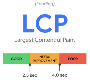
Largest Contentful Paint
What is LCP?
The time it takes for a website to show the user the largest element on the screen. LCP is used to analyse a website’s loading performance. According to Core Web Vitals, the largest element within the viewport must be visible within 2.5 seconds in relation to when the page initially started loading.
Research done at Google, coupled with discussions in the W3C Web Performance Working Group, found that analysing when the largest element was rendered onto the screen is the most accurate way to measure when the main content of a page is loaded. This is in contrast with prior suggestions to utilise metrics including the likes of First Meaningful Paint (FMP), as they may skew perception by capturing elements such as loading indicators that aren’t very relevant to the user. Therefore, LCP is a highly important user-centric metric for perceived load speed, marking the point in the page load timeline when the main content has likely loaded.
Common elements causing LCP
Amongst the main culprits include images, videos, and block level elements which contain text elements within. See the full list of API specifications for more information.
How is the LCP size reported?
The reported size of the element tends to be only the part of the element that is visible within the viewport, excluding any parts of an element that are overflowing off the viewport and not visible to the user. When it comes to images that have had their width or height dimensions modified from the original size, the reported size will be the visible image size, or the original image size, whichever is smaller. It is important to note that no margins, paddings, or borders added with Cascading Style Sheets (CSS) are taken into account, therefore text element sizes are reported on the mere size of the text node itself.
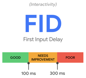
First Input Delay
What is FID?
A measurement to see how long it takes from when a user enters a website and performs an action such as a click to when the browser is able to respond to that action. FID is used to measure interactivity and load responsiveness. According to Core Web Vitals, the time it takes for the browser to respond to a user’s first interaction should not exceed 100 milliseconds.
In simpler terms, how fast can the browser respond to a user’s first interaction? This only entails events from discrete actions such as clicks and taps, adhering to the R in the RAIL performance model.
What causes long FID?
Generally speaking, FID occurs due to the browser’s inability to respond to the user, commonly due to the fact that the browser may be occupied performing tasks such as parsing large Javascript files at the time of the user’s interaction. Other common culprits include images that are not optimised for the user’s device.
Due to its nature, FID is tested on actual users and not so much on controlled environments. It is also worth mentioning that since not all users may interact with your site, you may at times see no FID score for given user sessions.
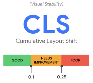
Cumulative Layout Shift
What is CLS?
CLS is the unexpected shifting of web page elements while the page is still downloading. It is used to determine visual stability during the entire lifespan of a webpage.
According to Core Web Vitals, webpages should not exceed a CLS score of 0.1.
What is a layout shift?
Layout shifts happen whenever a visible element changes its start position from one rendered frame to the next. The key part here is the start position, as when introducing new elements to the DOM or changing an existing element’s size will not cause CLS so long as they don’t alter the start position of other visible elements.
It’s important to note that layout shifts aren’t necessarily detrimental. The determining factor is whether or not the layout shift is expected. Many modern dynamic websites introduce elements or cause interactivity in response to user interactions, and potential layout shifts are totally fine as long as it occurs close to the user’s input. Layout shifts within 500 milliseconds of a user’s input tend to be safe to exclude from calculations.
Common causes of negative CLS
The evolving usage of images on the web serves as a great example to illustrate how CLS has become more prominent in the last few years. Before responsive web design was introduced, developers would include width and height attributes on elements on their images, allowing the browser to reserve the correct amount of space. This is different to modern standards, which set such attributes with their CSS, not allowing the browser to allocate the correct amount of space. Therefore, it’s best practice to always include width and height attributes to these elements. Alternatively, one can reserve the required space with CSS aspect ratio boxes, ensuring the browser can allocate the appropriate amount of space in the document while the image is loading in the background.
Common factors that contribute to negative CLS
- Slow server response and resource times
- Slow in-app API responses
- Unoptimised database queries
- Unoptimised images
- Render blocking JavaScript and CSS
- Client-side rendering
- Modern libraries and bundlers request assets like images, in particular hero images, behind JavaScript network requests
Techniques to mitigate CLS impact
- Use CSS, not JS, when making layout changes based on device, as using JS may increase the change delay
- Reserve space above the fold for dynamic content, including ads
- Avoid inserting new content above existing content, unless it’s in reaction to a user interaction
- Images:
- Always include width and height size attributes on your images and video elements
- If using source sets, ensure each image is using the same aspect ratio to ensure that your image width and height attributes can be set
- Use skeleton ‘loading’ container patterns with similar colours and sizes to the final image that’s being loaded
Tools in your arsenal
There are a number of tools available to view automatically generated detailed web reports, including but not limited to:
Lighthouse
- Generate mobile and desktop reports
- Colour coded metrics including CWV
- Trace snapshots of your elements as they appear
Google Page Speed Insights
- Audit your website against common user-centric metrics
- Generate suggestions after analysing the contents of your page
Web Vitals Chrome Extension
- Real-time view of all of your vitals metrics
- Get a sense of the performance of different sites
Chrome Dev Tools
The performance panel has an experience section that can help detect unexpected layout shifts
Conclusion
Core Web Vitals is an implementation looking to ensure the end user has the best experience possible with regards to their search query. In theory, if you are able to reach these benchmarks, you are in the right direction towards providing your users with the experience they are looking for. But don’t fret, not every website or application is the same, and not all metrics are achievable.
Go ahead and scope out how some of your favourite websites are currently ranking in terms of web performance and user experience. Generating a simple Lighthouse report may help you see a whole new user experience.