
Accessibility becomes meaningful when it is applied in delivery.
In the first article, “Accessibility Is Audience, Not Edge Case,” we explored why accessibility is not an edge case but a mainstream usability requirement. It is shaped by audience reality, regulation, brand expectations, and the limitations of automated tools.
This second part focuses on accessibility in practice.
The case studies below demonstrate how structured auditing and inclusive research were used to assess risk, improve usability, and create clear direction for delivery teams.
Case Study: Intact Insurance
How an Accessibility Audit Created a Roadmap to Inclusive Design
We worked with Intact Insurance, formerly RSA, the world’s oldest insurance company, to audit a website redesign before it reached critical delivery milestones.
The aim was to identify accessibility risks early, protect usability for a broad customer base, and create a clear path to highlight conformance.
Our Approach: Automated Checks Plus Manual Analysis
We used a blended method to identify issues across templates, components, and key journeys:
- Automated scanning to highlight common failures and patterns at scale
- Manual analysis across devices to identify issues missed or unable to be reliably verified by automated tools.
- Manual auditing against WCAG criteria, documented in a detailed audit workbook covering key pages across the site
- Assistive technology checks, including screen reader usage across devices
- Content and comprehension review, focusing on clarity, readability, and jargon
This combination matters because conformance is not just about what exists in code, but what users can successfully perceive, understand, and operate.
Structured Auditing Against WCAG
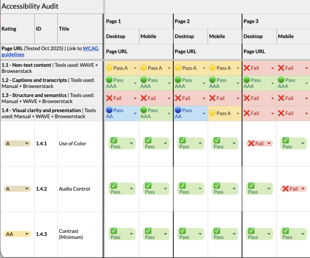
We created a detailed workbook covering template pages and key journeys across multiple devices. Each template was assessed against the Web Content Accessibility Guidelines (WCAG), with direct links to the relevant criteria included to make the findings easy to reference.
Each WCAG guideline was reviewed in detail and broken down into its specific success criteria. We then checked each one individually and clearly recorded whether each issue passed or failed at level A, AA, or AAA.
- A represents baseline requirements intended to address the most basic accessibility barriers.
- AA is the most commonly adopted standard, covering many of the real-world barriers users encounter.
- AAA is an enhanced standard that addresses additional user needs and is typically applied selectively.
While WCAG provides a useful framework, it represents a minimum threshold for accessibility, not a definition of best-in-class user experience.
Meeting these guidelines does not automatically mean an experience is perfectly usable, inclusive, or confidence-building for all users.
Where an issue failed across multiple levels, this was explicitly marked to avoid ambiguity.
This structured, transparent approach helped teams quickly understand not just what was failing, but why.
Results
The audit took a deep-dive approach to key templates and journeys, rather than a shallow scan of the entire site.
Across the tested pages, we identified 121 opportunities to improve accessibility across the redesign, covering WCAG criteria that did not yet reach AAA conformance.
These findings ranged from quick fixes to more substantial component-level improvements.
Just as importantly, the audit also highlighted areas of strong performance and confirmed where further investigation was not required, helping teams focus their efforts where they would have the greatest impact.
The internal team began working on fixes, updates, and changes immediately, with some implemented just hours after the audit was delivered.
Case Study: AJ Bell
Accessibility, Vulnerability, and Confidence
We worked with AJ Bell to evaluate a website redesign through usability testing with vulnerable users in a financial services context, where clarity, confidence, and trust are essential.
Accessibility was considered broadly, extending beyond physical disability to include users with low digital confidence, financial uncertainty, or difficulty processing complex information under pressure.
Going Beyond the Checklist
The research aimed to understand how well the redesign supported users’ needs and confidence, rather than simply assessing compliance. It explored:
- Confidence throughout key journeys and where motivational barriers emerged
- Navigation and taxonomy for different audience types (newbie, accumulator, enthusiast, and experienced investor)
- Users’ ability to compare products and services
- Clarity of content, tone, and visual hierarchy
In-Person Testing with Vulnerable Users
All testing was conducted in person to avoid remote barriers that could disproportionately affect vulnerable participants.
This approach ensures feedback focused entirely on the experience itself.
We recruited 12 participants across four groups:
- Visual impairments
- Physical disabilities
- Income shock
- Low digital skills
Key Insights
The research revealed a mix of broad and vulnerability-specific findings:
- Many of the most impactful accessibility improvements were clarity improvements that benefited all users.
- Some design elements did not work with assistive technologies, such as screen readers. Issues that would have been impossible to identify without inclusive testing.
- Observing users in real-world interactions revealed how they hold devices, navigate content, and process information, providing insight beyond typical usability testing.
- Users with low digital confidence were drawn to help and educational areas for guidance.
These insights gave AJ Bell clear opportunities to optimise the website design to support vulnerable users better, enhancing clarity, confidence, and accessibility for all.
Conclusion: Accessibility is Mainstream
These case studies show that accessibility cannot be addressed solely through automated checks.
It needs careful review, real user testing, and attention during the design and build process.
In both examples, the work did more than highlight compliance issues.
It helped teams see what needed to change, where to focus, and how to improve the experience in practical terms.
When accessibility is built into how digital products are designed and tested, it strengthens quality from the start rather than becoming a late fix.
If you are preparing for launch or refining an existing experience, get in touch to discuss how to review and strengthen accessibility practically.